What I Learnt About Tarot Deck Colors
You see those fancy Tarot decks everywhere, right? The ones that look like they belong in a museum, all black and white, or that weird abstract art that needs a degree just to figure out what card it is? Forget that stuff. New readers look at those and think they gotta have ’em to be serious. I spent months digging through deck after deck, trying to figure out what actually works when you’re just starting out. And trust me, it’s not about how minimalist or expensive it is.
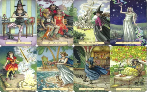
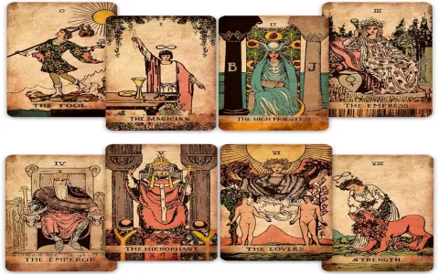
It all comes down to the big, simple, bright stuff. The color. You gotta have the color pop right off the card to make the image stick in your brain. A beginner needs to pull the Temperance card and immediately feel the flow and balance, and that happens best when the artist isn’t afraid of using real blues and golds. The market is a mess, though. You’ve got decks that look like the classic Rider-Waite-Smith art but are faded out like they were left in the sun for a decade. Then you’ve got the super artsy ones where the Five of Pentacles looks like a broken abstract sculpture instead of being cold and lonely.
How is any new reader supposed to connect with that? They buy three decks, get totally lost trying to figure out the creator’s specific “vision,” and then they quit reading entirely because it feels like too much work. I’ve seen it happen a hundred times, and I realized I had to figure out a better way to recommend things.
My Frustrating Journey to Finding the Good Stuff
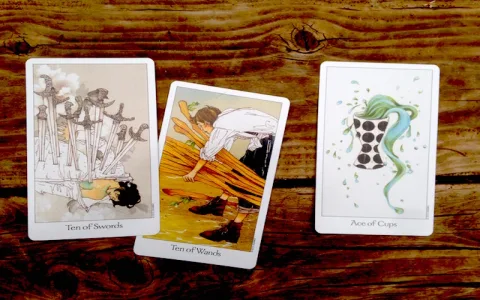
I only really got into this deep dive because of my younger brother, Mike. He kept bugging me about learning Tarot. He’s a super visual guy, and always forgets lists and text. I finally bought him this really popular indie deck, beautiful box, great stock, all the hype. We sat down together, he pulled the Ten of Swords, and he just stared at it. Blank look. He said, “It’s nice, but I don’t feel the end of something. It looks too grey.” The colors were too muted, too moody. The images were vague and focused too much on aesthetic over simple meaning.
That really got under my skin. It made me remember my own struggle years ago, trying to memorize rote meanings instead of letting the picture tell the story. I realized that deck wasn’t helping him see the story. The colors were lying about the energy. So I vowed to fix it. I decided I was going to find the decks that yelled the meaning at you through pure, unadulterated color and clear imagery. I knew that was the shortcut to actually learning the cards.
The Great Deck Scramble: Weeks of Testing and Comparing
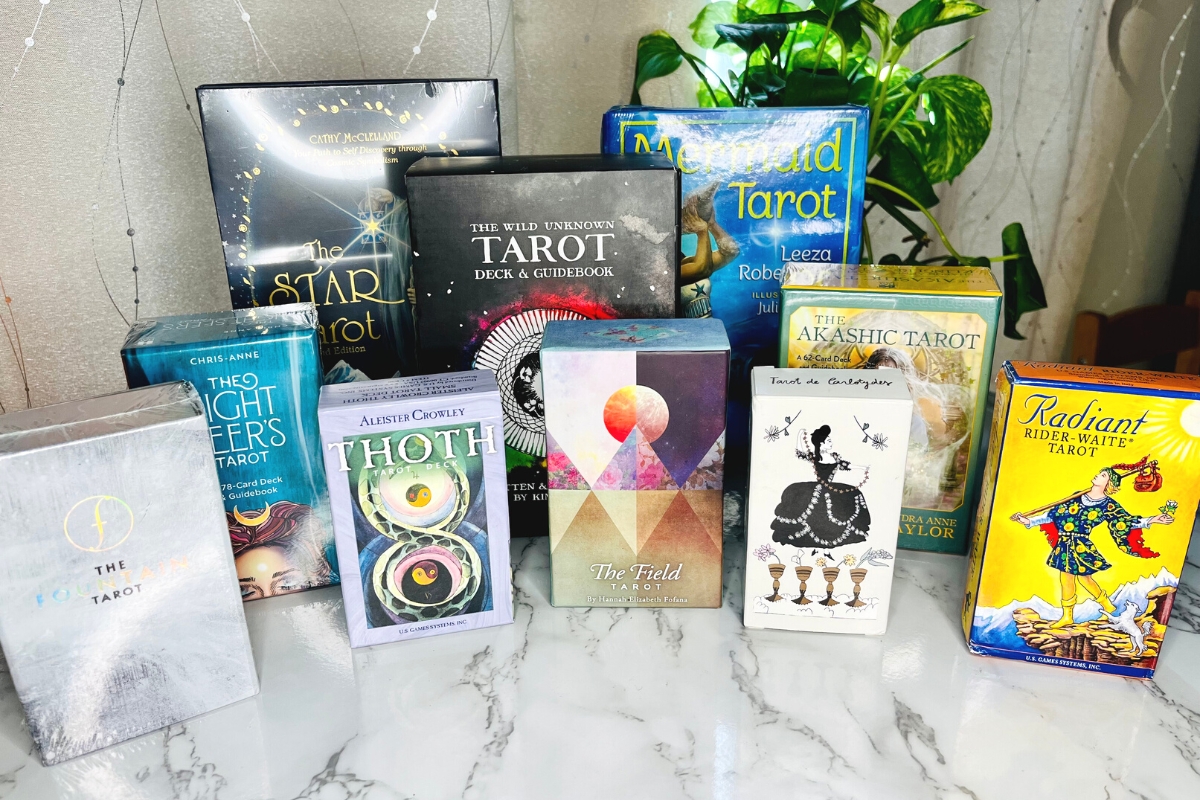
I started buying decks like a lunatic. Amazon, local shops, weird indie presses. I spent my whole paycheck on card stock and shipping costs. I pulled out my old journal and wrote down three iron-clad criteria for a beginner’s deck: One, the saturation had to be intense, like a comic book. Two, the classic RWS imagery had to be obvious, no hidden clues. Three, the emotional mood of the Major Arcana needed to be immediately recognizable by color alone. I ripped open the plastic on maybe eighteen decks in two months. My desk looked like a weird paper recycling center half the time.
I spent evenings shuffling and comparing. I took photos of the same card from ten different decks and put them next to each other, squinting at the screen, trying to figure out which one communicated the feeling best. I compared the reds of the Tower card. You’d be surprised how many decks are just plain cowardly with their reds and yellows—they look dusty or slightly pink! If the Two of Cups is about union, the colors shouldn’t fight each other, right? But half of them did! I kept tossing the duds into a box to give away to advanced readers—sorry folks, not good enough for a true beginner.
I used the decks for quick daily pulls for myself, testing how fast I could grab the meaning just by looking. If I had to pause for more than three seconds, the deck failed. The ones with crisp, clean color always won. They were faster, sharper, and the meaning jumped out at me. My favorite process was laying out all the Queens and seeing which one looked the most commanding—it was always the one with the boldest primary colors in the background.
My Top Picks After All That Work
After all the shuffling, the comparing, the arguments with myself about which deck stock felt the best to handle, I finally landed on three absolute winners. These are the decks that I handed to Mike (and a few other struggling friends) and watched their faces light up as they pulled a card and instantly got the vibe.
- The First One: This one is almost a cheat, but the colors are pure, clean gold. The blues are deep blue, the yellows are bright yellow. It’s like a simplified cartoon strip of life lessons. It makes the scary cards less intimidating because the image is so direct. I used it to teach Mike the basic meaning of the Majors in under forty-five minutes.
- The Second One: A bit more modern in the style, but they kept the color saturation cranked up. What I loved about this one is how the artist used backgrounds to amplify the meaning. The sky is always doing something important—it’s never just a blank wash. I did a week of morning readings with this one, just to make sure the energy felt consistent and not too gimmicky. It absolutely did.
- The Third One: This one is a little more under the radar, but man, the color palette is electric. It reads like neon signs in a good way. I tested it on an advanced friend too, just to make sure the simplicity held up, and she said the energy felt immediate and sharp. Perfect for someone who is too in their head and needs a visual slam to get them out of their own way.
So, why did I go through all this trouble just for a few recommendations? Because ever since I gave Mike those beginner decks, he hasn’t stopped practicing. That fancy indie deck I first gave him? He keeps it on a shelf for decoration. He told me, “It’s nice to look at, but this colorful one finally started talking to me.” That’s the entire point. Beginners need decks that talk, not decks that whisper from across the room. And if the publisher can’t use a decent ink cartridge, they’re wasting your time. Stick to the loud, clear, bold colors. Trust me. I bought twenty-eight decks to prove it.