Look, I gotta be straight up with you all. I didn’t want to buy these decks. I really didn’t. I’ve been using the same beat-up Rider-Waite deck for fifteen years, and a standard, well-loved Lenormand set that cost me about thirty bucks a decade ago. It works. The readings are clear. The cards practically shuffle themselves.
So why did I shell out nearly five hundred dollars on five different, supposedly ‘artistically superior’ indie decks this month, including two fancy Tarot/Lenormand combination sets?
It was pure spite, honestly.
The Kick in the Pants: Why I Went Shopping
My regular income comes from doing readings at the local market on Saturdays and private sessions during the week. But a new reader set up shop three stalls down from me. Her name is ‘Aura Amelia,’ and she’s big on TikTok. Every client she had was gushing about the aesthetics. “Oh, the shimmer! The metallic ink! The weighty card stock!”
I started noticing my clients getting curious. They kept asking me, “Are your cards old? Should I be using those minimalist ones I saw on Instagram? Do the gold ones give better answers?” I told them it was bogus, that the energy comes from the reader and the query, not the glossy box. But they kept asking. And worse, one of my best clients actually went over to Aura Amelia for a reading, saying she needed a “visual upgrade” to her spiritual practice. That was it. I snapped. I decided I had to buy the whole shebang, test them to death, and prove that shiny packaging doesn’t equal better insight.
Phase 1: Getting Ripped Off (The Acquisition)
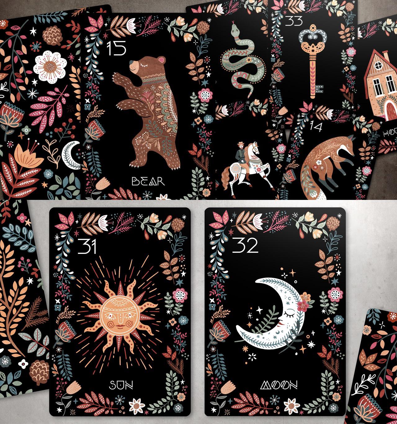
I went online and started ordering. I didn’t just buy any random deck; I aimed specifically for the types Aura Amelia was flexing: that fancy Lenormand with the thick gold foil edges, a super-minimalist geometric Tarot deck, and two different ‘dark aesthetic’ indie Tarots that cost fifty bucks each just for the limited edition print run. I bought five decks total, knowing damn well this was purely a research expense.
When they arrived, I unboxed the lot over a weekend. It felt like opening a bunch of designer purses, not spiritual tools.
- The packaging? Fantastic. Seriously slick magnetic boxes and velvety pouches.
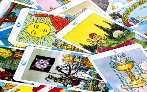
- The card stock? Extremely thick on three of them, which sounds good until you try to shuffle. One deck’s foil started flaking off just from me running my thumb down the side twice.
- The artwork? Absolutely stunning. No doubt these artists are talented. But were they easy to read? That’s another story.
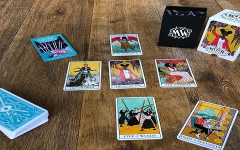
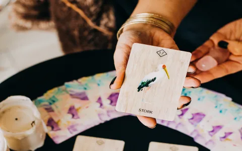
I immediately ran into trouble with the Lenormand hybrid decks. The artists had taken such ‘creative license’ that the standard symbols were barely recognizable. The ‘Dog’ looked like a futuristic robot hound. The ‘Whip’ looked like a piece of abstract stained glass. I spent more time trying to figure out what the card was than what it actually meant in the context of the reading.
Phase 2: The Real Work (Testing Side-by-Side)
I spent the next four days doing personal test readings. I didn’t tell my clients yet. I did every self-reading twice: once with my old, reliable decks, and then immediately after with one of the new, expensive ones. I kept meticulous notes on interpretation speed and clarity.
What I discovered was simple: The core information conveyed by the spreads was exactly the same.
If my Rider-Waite spread said, “You’re going to get an unexpected offer for travel but it might be rushed,” the new, moody, monochromatic deck gave me ‘The Chariot’ reversed next to ‘The Fool,’ which still meant, “You’re going to get an unexpected offer for travel, but you should probably think twice.” Same message. Just filtered through a much prettier, and much less standardized, visual system.
The biggest pain point was the mechanical action of reading. Shuffling was a nightmare. My hands are used to handling my well-worn, flexible decks. These new ones, especially the ones with the sticky matte finish and sharp edges, constantly stuck together. I was constantly dropping cards, which completely ruins the flow and energy of a reading. I hate faffing about trying to pick up the 10 of Swords when I’m supposed to be connecting with the client’s timeline, you know? It breaks the trance.
Phase 3: The Client Verdict and The Realization
After a week of personal testing, I finally started using the new decks during client sessions. I gave clients the option: “Do you want to use the standard, proven decks, or these brand-new, visually interesting ones that are all the rage?” About 70% chose the new ones, purely out of curiosity or because they thought they were ‘better.’
I monitored their reaction. Did the ‘visual energy’ Aura Amelia talked about actually make the reading better for them?
- Client A loved the aesthetic, but kept losing focus because the art was too busy and detailed. She actually asked me to switch back to the standard deck halfway through, saying her brain hurt.
- Client B thought the deck was ‘powerful’ but admitted the reading was no clearer or more accurate than her usual sessions with me.
- Client C got completely distracted, spending five minutes trying to identify the esoteric symbols on the card instead of focusing on the question they had paid me to answer.
Here’s the thing I realized, which these deck sellers will never tell you: The decks that were the easiest and quickest to read were the ones that stuck closest to the established symbolism. The minute the artist got too creative—making the Tower look like a weird glowing orb instead of an actual Tower—it became a hinderance, not a help. It introduced friction where there should be immediate, universal clarity.
My Final Takeaway: Are They Worth It?
No. Absolutely not. Unless you are buying them purely as collector’s items or artwork for your shelf, they are not worth the hefty money for actual professional practice. I spent five hundred bucks to confirm that my old, trusted, twenty-dollar deck works just as well, if not better, because it lets the meaning shine through without the visual noise and the headache of sticky shuffling.
I learned my lesson: Don’t let shiny competitors or Instagram hype pressure you into thinking you need a “visual upgrade.” I’m sticking to my old decks. The five fancy ones? They’re sitting in a box right now. Maybe I’ll use them as wall art. But for real work? Stick to the tools that get the job done efficiently and actually pay the rent, not the ones that just look pretty for a photo op. That’s the real talk from a real reader.